BIAF. One festival. All the arts.
For its sixth edition, Buzău International Arts Festival brought together film, theatre, music, literature, photography and fine arts. For an entire month, Buzău’s biggest festival transformed the city into a meeting place for artists, audiences and local culture.
For Uncle-Nephew, it was a 360° creative undertaking: from the concept and visual identity to every aspect of the festival’s design and communications. Social media, posters, banners, flyers, promotional materials, stage graphics, indoor and outdoor branding — all built around one idea: Buzău and the arts have a story to tell together.
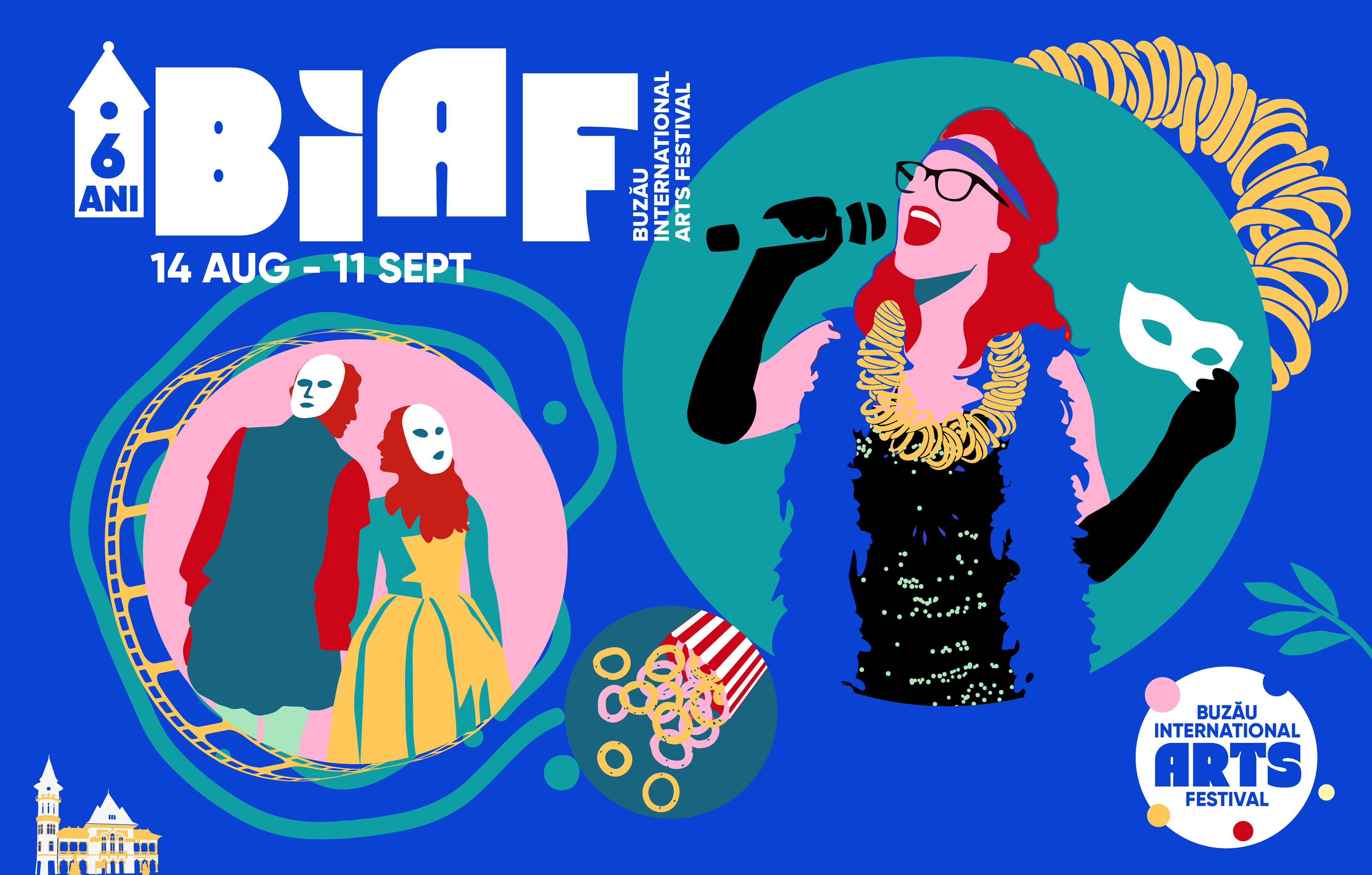
The arts come together. Buzău takes the stage.
A necklace of pretzels becomes a stage accessory. A popcorn box gets a local filling. The “Hen with the Golden Chicks” treasure, amber, the Mud Volcanoes and Buzău’s City Hall find their place alongside microphones, theatre masks, film strips and characters.
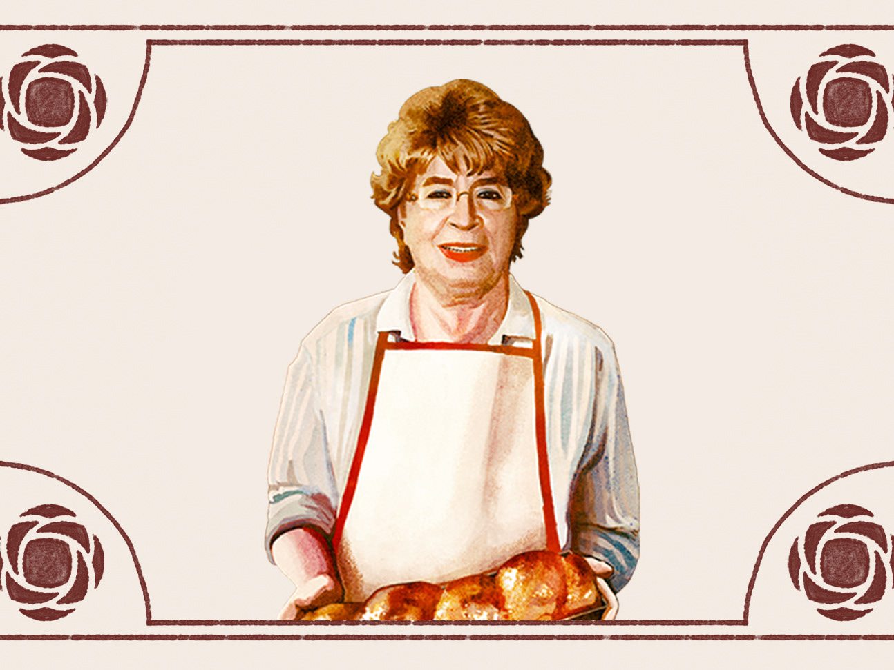
We brought Buzău’s cultural icons into a contemporary visual world full of colour and playfulness. A cultural mash-up where local tradition meets the energy of the festival, and familiar things take on unexpected roles.
Such a diverse programme needed a clear, recognisable structure. We developed a family of logos with a shared typographic language, expressive shapes and a distinct personality for each category.
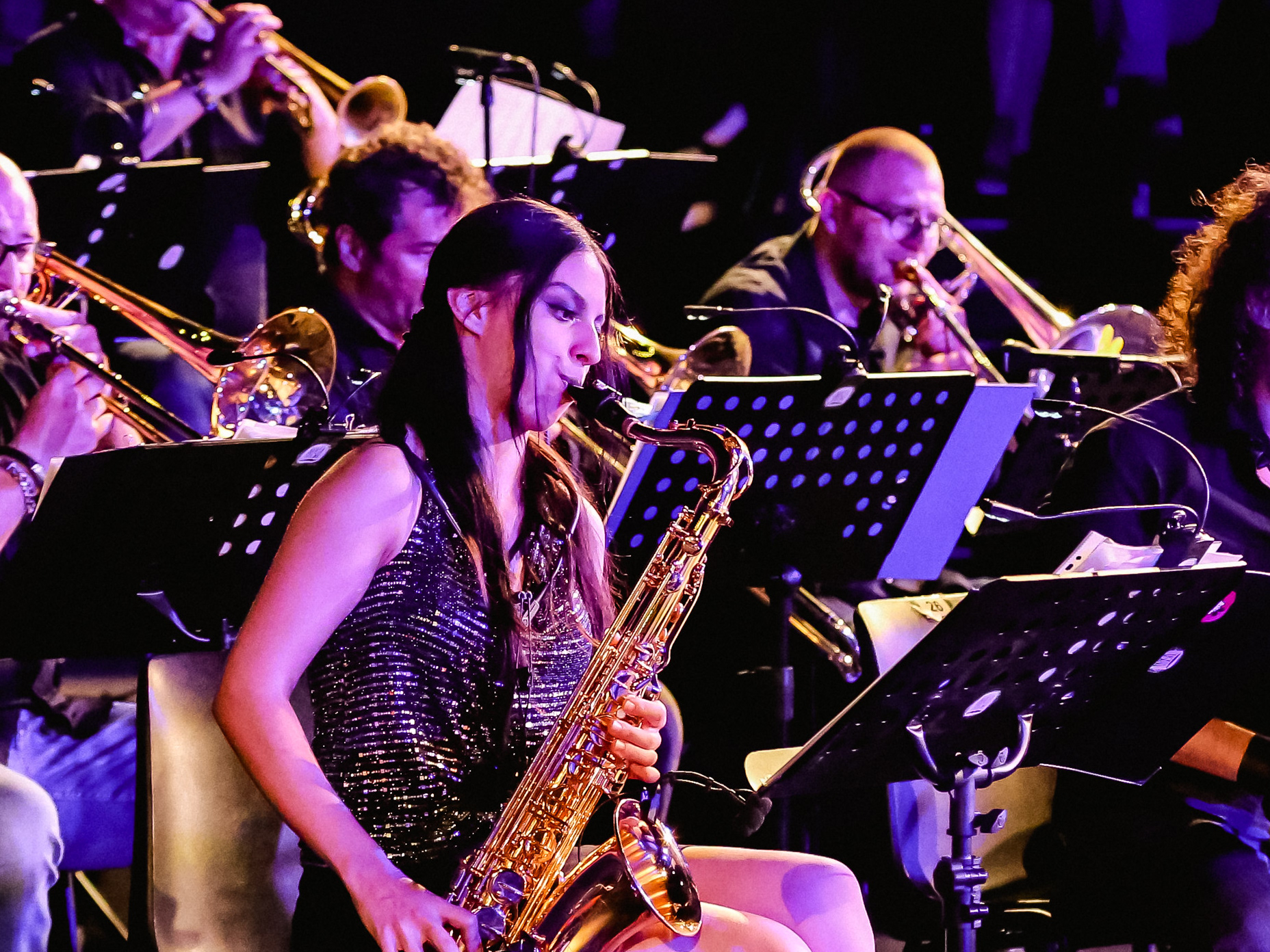
BUZZIFF is BIAF’s film festival. COMIC 7B brings theatre into the family. BIAF Gallery is home to photography, Art Expo brings together the fine arts, and Music gives the concerts their own identity.
Lit opens up a space for literature, Press is dedicated to the media, and Talks puts conversations and guest encounters centre stage. Together, they form an identity designed to grow: each name retains its own voice while remaining unmistakably part of BIAF.
Lit opens up a space for literature, Press is dedicated to the media, and Talks puts conversations and guest encounters centre stage. Together, they form an identity designed to grow: each name retains its own voice while remaining unmistakably part of BIAF.
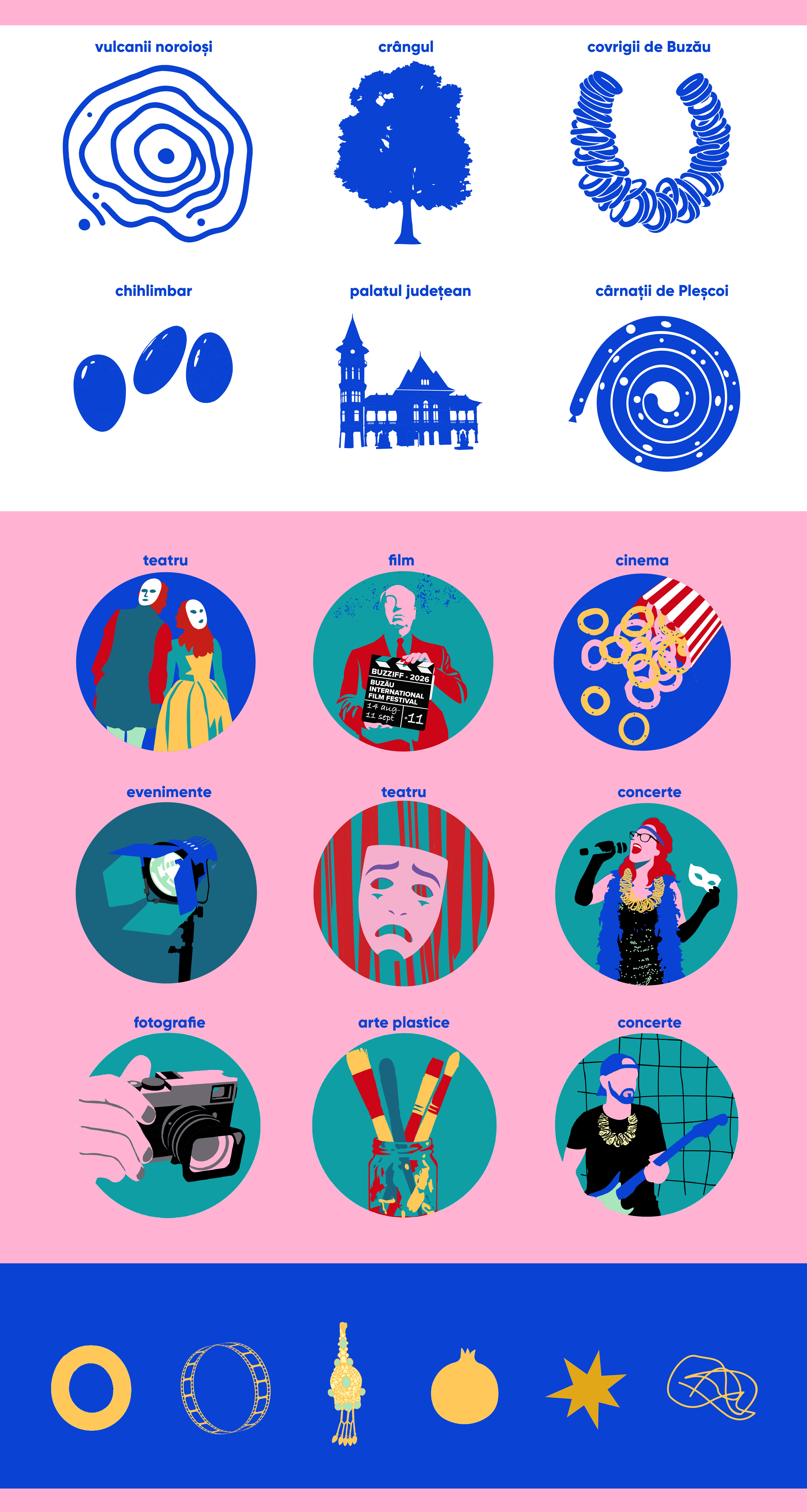
A shared language for different worlds.
Characters, objects and symbols move from one composition to the next. Fluid shapes connect them, circles become miniature stages, and bold colours set the rhythm of the entire identity.
We built a visual vocabulary that lets each art form tell its own story while staying connected to the festival. The same energy runs through everything, from the key visual to the poster for a single event.

A festival with so many art forms, guests and events needs a system that works day after day. We developed the logo family, illustration library, visual guidelines and templates that enabled designers to create new materials within a consistent creative framework.
From screening announcements to theatre programmes, exhibition posters to stage graphics, the system offered flexibility without sacrificing coherence. A shared identity, built to support an entire month of culture in motion.